A Fresh
Chapter


Services
Visual identity / Packaging
The project
Michellod’s image had changed very little over the past few years. That’s why the company was looking for a brand identity that aligned more closely with its inspirations, a more modern identity that also reflects the artisanal tradition at the heart of the business.
Our mission
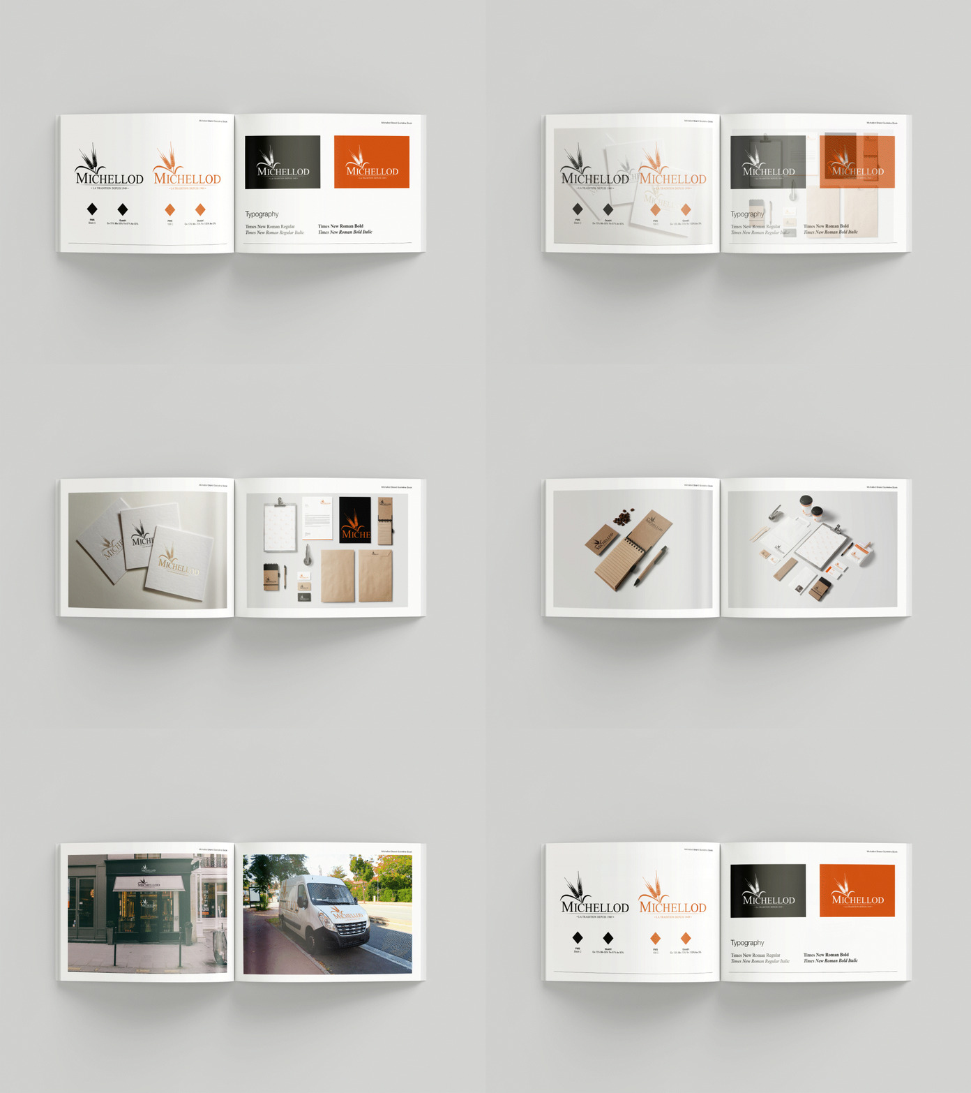
Starting from its current identity, the goal was to modernize it to make it more recognizable and more aligned with the artisanal tradition the brand wants to highlight. It needed to be applicable across all products and versatile, simplified, unified, and updated.
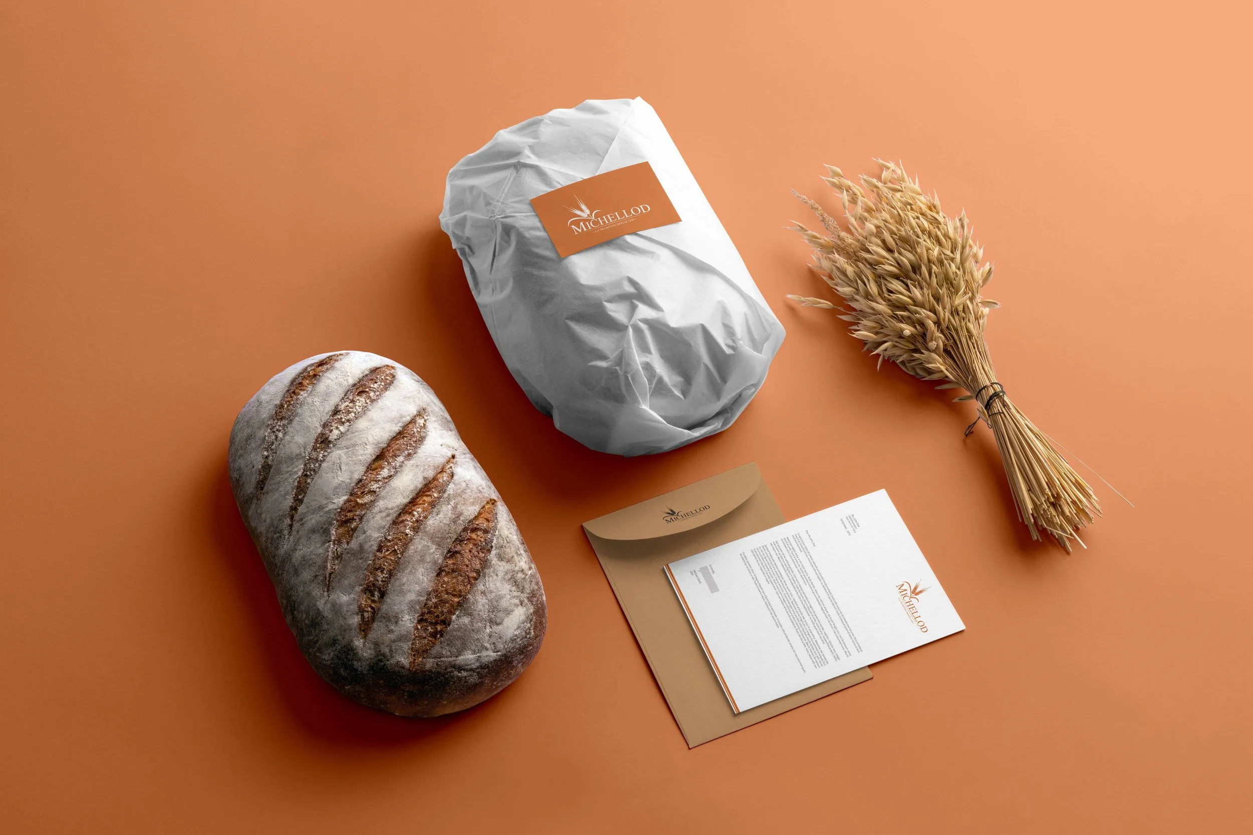
We therefore redesigned the logo and graphic guidelines to reflect this new image, then developed various packaging and communication materials the company would need for its stores and overall operations.
The before/after of the logo


Some packaging designs


Michellod
Let’s work together
Feeling inspired to start designing your own project?
Whether you have a clear idea or need a helping hand to shape your thinking, we’re here to help.


